Use our custom tooltip and popovers styles to add tooltips and popovers to any element on your website.
<button type="button" class="btn btn-soft-primary rounded-pill" data-bs-toggle="tooltip" data-bs-placement="top" title="Tooltip on top"> Tooltip on top </button> <button type="button" class="btn btn-soft-primary rounded-pill" data-bs-toggle="tooltip" data-bs-placement="right" title="Tooltip on right"> Tooltip on right </button> <button type="button" class="btn btn-soft-primary rounded-pill" data-bs-toggle="tooltip" data-bs-placement="bottom" title="Tooltip on bottom"> Tooltip on bottom </button> <button type="button" class="btn btn-soft-primary rounded-pill" data-bs-toggle="tooltip" data-bs-placement="left" title="Tooltip on left"> Tooltip on left </button>
<a class="btn btn-primary rounded-pill" tabindex="0" data-bs-toggle="popover" data-bs-trigger="focus" data-bs-placement="top" title="Sample Title" data-bs-content="Top popover"> Popover on top </a> <a class="btn btn-primary rounded-pill" tabindex="0" data-bs-toggle="popover" data-bs-trigger="focus" data-bs-placement="right" title="Sample Title" data-bs-content="Right popover"> Popover on right </a> <a class="btn btn-primary rounded-pill" tabindex="0" data-bs-toggle="popover" data-bs-trigger="focus" data-bs-placement="bottom" title="Sample Title" data-bs-content="Bottom popover"> Popover on bottom </a> <a class="btn btn-primary rounded-pill" tabindex="0" data-bs-toggle="popover" data-bs-trigger="focus" data-bs-placement="left" title="Sample Title" data-bs-content="Left popover"> Popover on left </a>
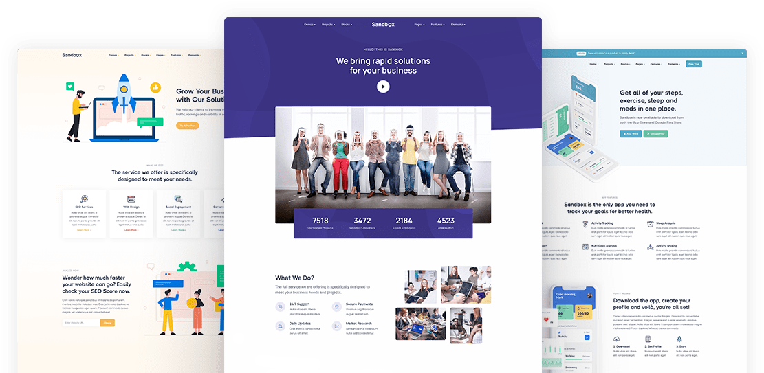
Everything you need to create your next unique and professional website, including impressive and ready-made blocks and pages.